In today’s visual world, appearance is everything and we are judged on how we represent ourselves. The Logo (an abbreviation of the words Logogram and/ or Logotype , which in turn are derived from the Greek word Logos which translates into ‘word’ or imprint’) — a graphic mark, emblem, or symbol commonly used by commercial enterprises, organizations and even individuals to aid and promote instant public identification and recognition of their products and/or services – and subsequently, it’s design is therefore, of paramount importance.
“immediate recognition, inspiring trust, admiration, loyalty and an implied superiority.” – Jacob Cass
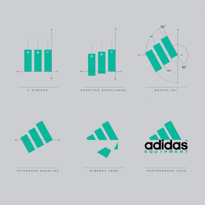
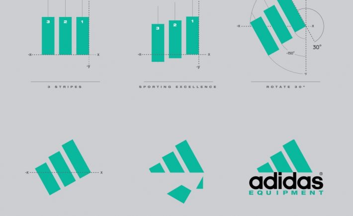
- Know who you are: Top brands like Adidas (conquering the mountain), Amazon (from A to Z), Domino’s Pizza (the number game) and Mitsubishi (three diamonds) all know who they are and what they represent. Who are you? Serious. Fun. Cutting-edge. Elegant. Friendly. Cost effective. Complex. Represent your true personality and business image through your Logo. This is your “brand.” To quote Paula Hope, Referral Marketing Expert with the Referral Institute: “To be specific is to be terrific.” A mismatch can be disastrous.

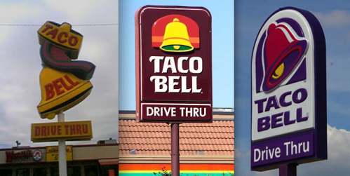
How the Adidas logo earned its stripes - Who you are is not necessarily what you do: A Logo does not need to show what a business sells or offers as a service. ie. Car logos don’t need to show cars; food logos don’t need to show food. The Toyota logo is not a car, nor is the bell in Taco Bell edible. A logo is purely for identification.

The Evolution of Fast Food Logos - Know who your audience is: Always remember that while it’s nice to love your own logo, it is not for you but must appeal to the clients and customers you are trying to attract. Your Logo must be appropriate. The colorful, fun Toys”R”us logo in its childish font is designed to appeal to children. A subtle balance between representing your personality while capturing audience appeal is the best way to go.

10 successful logo redesigns - Deep Impact: Today’s world is fast paced. No one has the time to appreciate or decipher the intricacies of a Logo. A Logo has to instantly grab its viewer’s attention and it then needs to stay there. Keep your logo nice and simple. Create a captivating yet memorable design. Time is money, too. Rather than designing it yourself or hiring an internal design team, consider crowdsourcing logo design services as a cost efficient option that speeds up the creative process to boot.

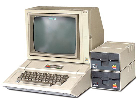
The 12 rules of logo design - Think Different: ‘The logo is one aspect of a company’s commercial brand, or economic entity, and its shapes, colours, fonts, and images usually are different from others in a similar market.’ Like the designers of Apple’s iconic logo, be unique by standing out in your industry. Avoid overused trends and clichés and never ever copy anyone’s Logo (especially your competitions) Again, it is often better to have a mark that does not depict your company functions literally or absolutely. Abstract and symbolic logos are much more adaptable, flexible and interesting.

Interview with Rob Janoff, designer of the Apple logo - Think Versatile – Repetition of its Logo is one of the reasons Nike got famous. Today companies will want to replicate their Logos on billboards, t-shirts, badges, stationery. Everything!! While designing a Logo, keep in mind the following to ensure your logo stays effective no matter what:
- Appropriate aspect ratio and footprint – A logo’s shape, proportion and footprint are critical. For maximum adaptability your logo should be designed as square or horizontal. Square icons are adaptable for use on everything from social media to baseball caps.
- Scalable – Pixel size is important in creating a Logo and they are best designed in vector format. Vectors are outline digital file types that allow editing and unlimited scaling of your logo so that you can print your logo on anything from a stamp to a billboard. Never use a photograph in your logo because they are bitmaps, not vector.
- Color selection – Designing a Logo in black and white augments its versatility by allowing focus on the concept and shape of the Logo. Color is secondary to Logo designing. A logo must be successful in black, white and any colour, and should be readable in any format. Subtle shading can disappear when translated to black-and-white or reduced to a smaller size. Also the more colors used increases printing costs.
- Cross-Media – A logo should work on a variety of media, such as websites and print, but remember that it should have a faxable version as well.
Jacob Cass, the professional logo designer in his blog Just Creative Design says that the purpose of a logo’s design is for ‘immediate recognition, inspiring trust, admiration, loyalty and an implied superiority.’
Remember, a badly designed Logo could damage a company’s reputation, finance and overall business. On the other hand, if designed correctly a company’s Logo could be one of its silent & indirect, yet chief reason for success in outperforming competition!

