
Statista data reveals that 47.28% of America’s web traffic originated from mobile devices as of 2021’s fourth quarter. Many people now own smartphones, so anyone visiting your business website is likely doing so from a mobile device. Consequently, it is no surprise that search engines such as Google have shifted their focus to mobile-first indexing, giving preference to more mobile-friendly sites in ranking. Therefore, making your website mobile-friendly for your users and site crawlers is prudent. Here are four effective ways to make your website mobile-friendly.
1. Have a responsive layout

Any web design company worth their salt will agree that a responsive layout is the best way to create a website that works excellently on both desktop and mobile platforms. This is because a responsive layout has all the same information and content regardless of the device you are accessing it on. It also resizes itself according to the specific gadget used to view it. Consequently, any website with a responsive layout can adapt to various screen sizes without problems. A responsive layout is key because it can make your site mobile-friendly without restricting the information its visitors can see. Google highly recommends a responsive layout, so you will be rewarded with a search result ranking boost by simply doing this.
2. Prioritize site speed

Google’s research reveals that 56% of mobile users will abandon a website that takes more than 3 seconds to load. Therefore, site speed is crucial in creating a positive first impression on users, so you should do everything you can to make your website load faster. You can run a website speed test using various tools to discover how fast your site loads. Consider compressing your high-resolution images and CSS if it takes longer than three seconds. You can also upgrade your web hosting plan and use the AMP plugin (for WordPress websites) to guarantee faster load times.
3. Get rid of text-blocking ads and pop-ups
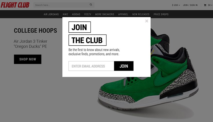
It’s safe to say nobody likes pop-ups and text-blocking ads in any context. However, these elements can work well on your website’s desktop version if used very carefully. Smartphone users have smaller screens, so it can be extremely frustrating to encounter pop-ups that eclipse relevant content when they visit your site. As such, many of your site’s visitors will likely leave for a better website before minimizing these intrusive elements. Consequently, it is best to avoid pop-ups and text-blocking ads altogether to create an overall positive user experience for your mobile visitors.
4. Make buttons big enough to work on mobile

You can easily find buttons of all sizes with a mouse when using a desktop, but this task becomes significantly harder when using your fingers on a smartphone screen. Small buttons are especially hard to deal with, especially if they are many and close to one another. Therefore, use bigger buttons on your website to make it easier for your site’s visitors to find them. You can also place these buttons at the right place, which is basically anywhere on the screen your thumb can effortlessly reach.