Whenever you need to distribute information quickly and to a large audience, a brochure will become a nice lifesaver. The production of this page layout is demanding in terms of checking a lot of parameters to prepare an image that is harmonious in its details and comply with the dedicated brand objectives. That is why it is a crucial challenge for any interested party to make a brochure reveal its functional and visual peculiarities accurately and theme-appropriately.
From this perspective, even newcomers in the field have to get to know more about the basic knowledge — what types of brochure folds are designed in general.
How to Determine Brochure Kinds
Knowing which folds are present there in the market will help you consider which brochure kind is the best match for your project’s goal. Overall, the number of folds, their orientation, and the end size of the file are what differentiate possible options from each other. Here is a quick guide to get a precise understanding of what is what:
- Standard print design software for Mac usually offers a lot of half-fold brochure templates. In its essence, it is a booklet. All you need to do for its creation is to make a single fold in the page middle to achieve equidistant parts. This format will work for any piece of paper, including tabloid, letter, junior legal, and legal options. It requires brief messages, but images to include can be adorable.

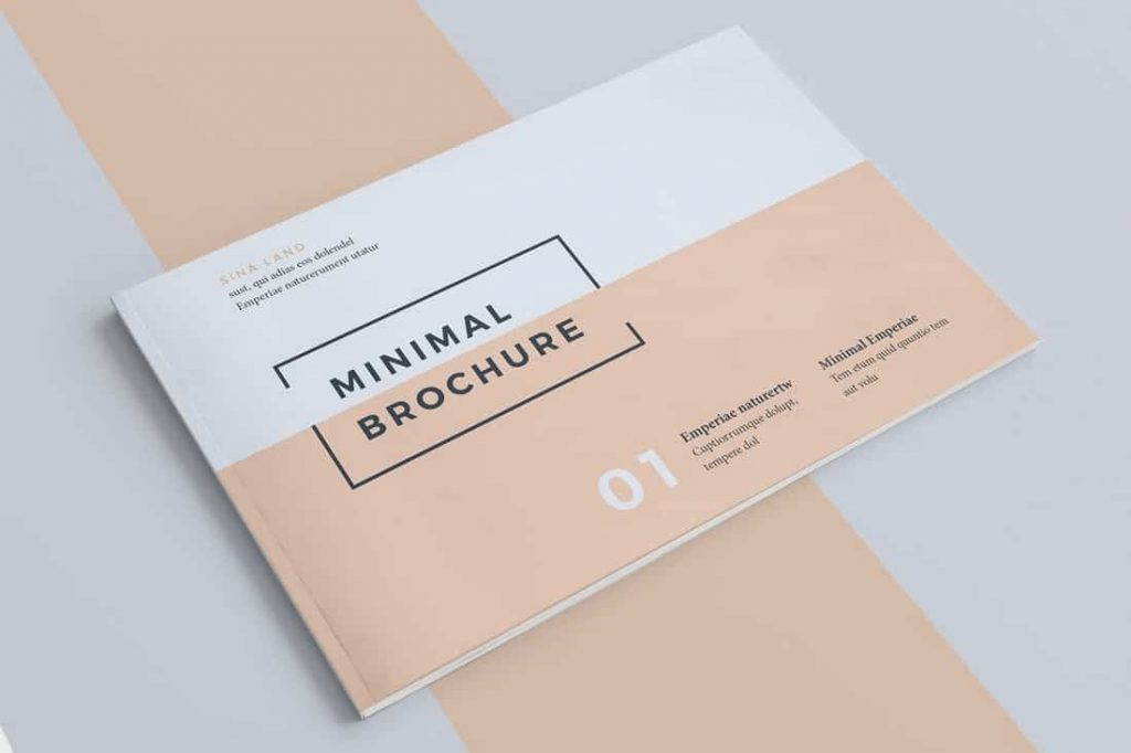
- When it comes to tri-fold brochures, the principle of creation is similar to the previous case. While the panels’ sizes are kept equal, the general paper dimensions may differ. The most preferable solution is 8.5 inches by 11 inches. But other configurations can take place too and be enlarged up to 11 inches by 25.5 inches. This is the best layout to place information structurally (business releases, for instance).

- Z-fold has the same dimensions as simple tri-fold brochures, but their orientation is different. This layout resembles a zig-zag object. The present unusual construction allows for more unique and even extravagant information presentations. For instance, it is a good basis for 3D effects.

- Accordion folds are a multiplied Z-fold. It is usually bigger than other samples with the largest option available in 21.25 inches by 8.5 inches. It is a good option to prepare interactive content for your party guests (quest games, for example). Moreover, you can use its panels to print information in a tricky way such as a single phrase that unites all of the pages.

- The overall layout’s design is similar to tri-fold brochures, but it doesn’t have equal panels. The middle one is the largest. This feature is what makes it look like a window. If you want large and complex illustrations to be visualized qualitatively, that is the best shot. Double gate-fold is achieved by bending the central part as well. The smallest size is 8.5 inches by 14 inches. This type is usually preferred to provide text information in brief forms.
- The double parallel fold isn’t quite popular because its creation is commonly non-affordable by typical page design software for Mac. Although that’s not the case with Swift Publisher. All you need to do is to keep on bending the piece of virtual paper to achieve sixteen equal panels in the end. Just think about a standard map to understand its appearance. Who knows, maybe you will find a better realization for it.
- French and Roll folds are always there whenever you need to minimize the volume of your project. In the first case, apart from vertical folds, there are also horizontal ones that form perpendicular curves. In the second case, a succession of parallel bending results in a format that is usually sized as 4.5 inches by 9 inches.
Visual Content of Your Brochures
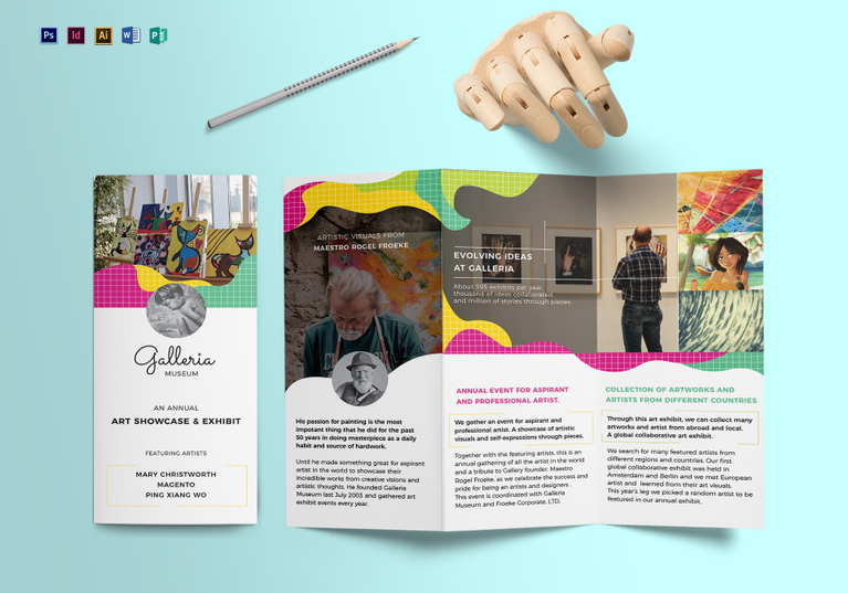
Apart from thinking about which type of fold will suit your objectives in the best way possible, it is a must-have task to consider how you are going to design this layout. The brochure composition predetermines which volumes of information can be included in the project. Don’t hesitate to diversify your visual content by adding eye-catching and corresponding images or photos to illustrate the presented data. For instance, a hotel or a travel brochure that has information about room booking but doesn’t show off the location’s beauty through pictures will be lacking.
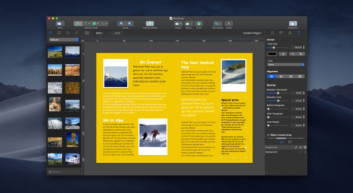
On the contrary, if you prepare illustrative material for a more official event, then it is an excellent idea to include infographics like tables or charts in your business brochure. As you see, this palette of choices demands an appropriate tool to make your desktop publishing flawless. Swift Publisher will contribute to your teamwork efficiency greatly in this case.
Unlike numerous other publishing tools for Mac, its learning curve isn’t steep and is affordable for complete newbies even — over 500 templates will definitely come in handy. Rich clipart collections, never-to-be-forgotten headings, two-page spreads — these are just some of the features to be amazed at. For more practical experience, don’t hesitate to test this powerhouse for free.