Web forms are an essential part of any website, especially online businesses that need more than just a good ol’ contact form. They need feedback forms, order forms, service request forms, etc., and, depending on the business, even those funny quiz articles that tell you which Marvel or DC character you could be.
Point is, web forms are as varied as they come and if you want them to perform well, you need to design them well. This means you need to consider the look, functionality, and end-goal of the form before you create it with HTML/CSS coding, or, even better, use a powerful online form creator, like MightyForms, to quickly create a form with customizable features.
Make it unique

Let’s start with the form’s look. If you’ve browsed the internet long enough you’ve noticed how most forms follow a nearly identical format. The design is clean, makes use of a lot of white space and the data required from the user is also pretty much the same (name, e-mail, and message). While this design is effective to a point, it does nothing to offer a unique experience and a memorable interaction.
Why not implement the brand’s color scheme into the form? Add the company’s logo and anticipate the user’s needs with dropdown and choice fields that narrow down what they want to ask. This is a moment that your user needs your help, and the faster you can give it to them, the less time they have to look at your competitors.
Make it responsive

Web design 101, yes, of course, your form needs to be responsive. Pretty much everyone and their cousins access the internet via a mobile device at some point during their day. If they have a hard time viewing your form, they’ll likely give up on filling it out if they even bothered to start in the first place.
If you’re using an online form creator, all forms you create will automatically be responsive and adjust its content for all devices. If you choose to code the form yourself, test its responsiveness with a mobile emulator or the device mode on Google Chrome’s DevTools.
Make it effective
Your form will only be as good as the results it brings you. It can be the most beautiful form on the internet, but if it’s not getting you any results, or worse, it’s just there with no end-goal to measure its performance, you just wasted perfectly good coding.
MightyForms Form Builder is especially helpful with this. Since you can integrate your form with Google Tag Manager and Google Analytics, you can measure your web form’s performance alongside the rest of your website.
Thank the user

You don’t need to read a lot of online comments to notice how manners go a long way in the digital spectrum. Don’t forget that users are under no obligation to engage with your web forms, you should always thank them in some way for taking the time to provide you with the information you need to keep the interaction going.
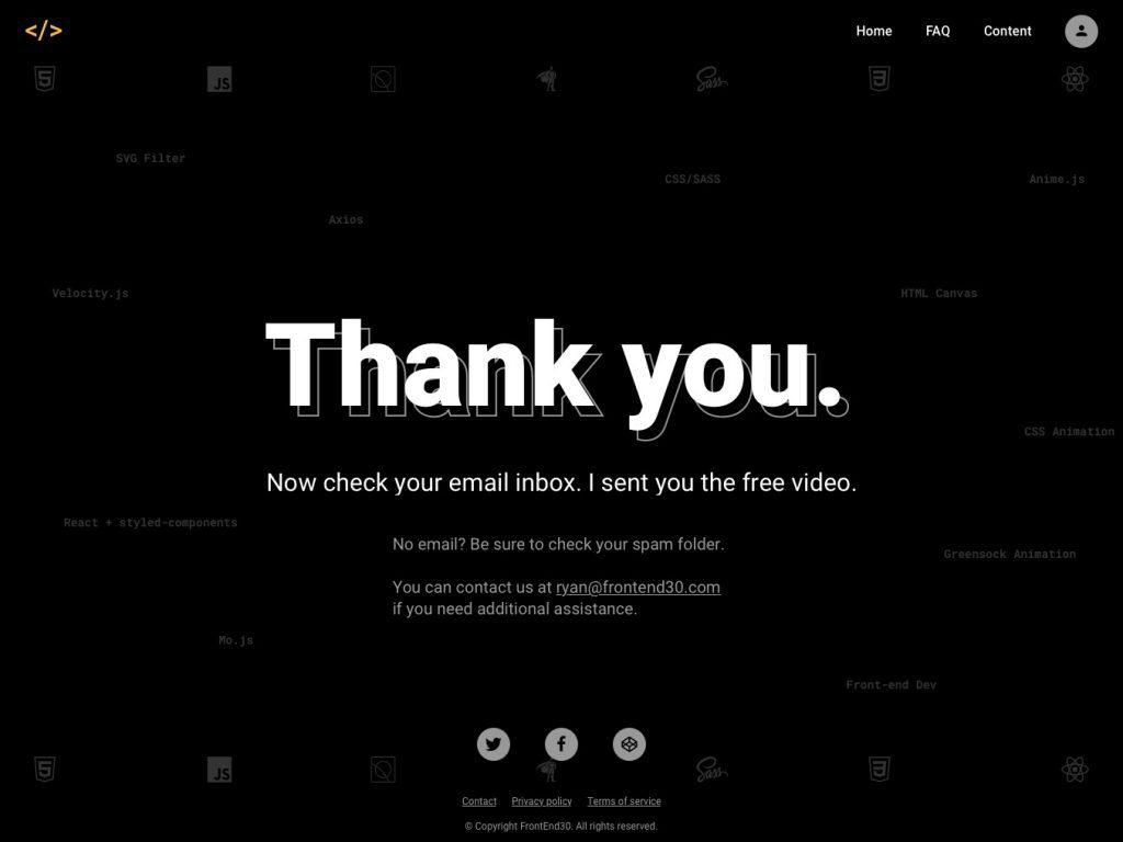
This means adding a pop-up message at the end, letting them know that the submission was successful, or even redirecting them to a unique page. If they submitted their e-mail, it’s an extra nice touch to set up an autoresponder that sends them a personalized e-mail.
Automate the process

The first reason for you to implement a web form into your online platform is that it’s a bridge of communication with your users that is open 24/7. They can send a message at any time and you can add an extra edge of attention to detail with a personalized auto message that confirms their submission and notifies you, too.
The automation doesn’t need to stop there. A powerful online form builder allows you to integrate your form with several productivity tools so that whenever you get a new submission, the data can be automatically saved on Google Drive or Dropbox, trigger a new task on a project management tool and so much more.
Designing a great web form doesn’t need to be a coding nightmare and adding functionalities and automation is easily done if you opt to use a no-code online form creator.


