If a person is the mirror of a soul, then the logo is a representation of the whole essence of your company. You cannot even imagine how important it is: sometimes the logos speak much more about the company than its mission.

Embracing Technology with Automated Logo Designs
What is logo and why do you need it?
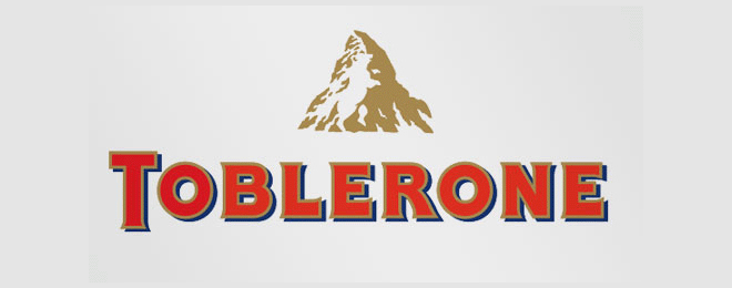
Think You Know Them All? The Hidden Meaning In Logos
Almost any part of the logo – its color, shape, font, small details – carries hidden information for the customer, and on subconscious level can affect certain desires, decisions and preferences. For the development of your company it is very important that all the details of the future logo were meaningful, had a certain value, and meet all the given criteria.
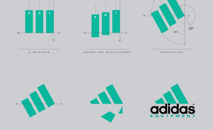
Top Logo Designing Tips Straight From the Field
Therefore, if you wonder how to create a logo, or for a long time have been looking for useful information on the color of the logo and its effect on the subconsciousness of customers, then in this article you will find the answers to all questions of interest.
A Showcase of Intelligent Logos
By the way, very popular topic nowadays is using the website builders for creating own website and logo too.
Consider the sphere
How A Logo Design Can Help You Get High Profile Clients & Reach A Wider Audience
The form and details of the logo in many ways depend on the sphere of your company. Not even from the field of activity, but from customers, their preferences and vision of this sphere. If you are engaged in serious business, for example, deliveries of industrial equipment, then the logo should be executed in strict tones, with clear forms.
Having looked at this logo, the customer should immediately understand three factors: seriousness, responsibility, solidity, no superfluous elements.

Business Branding 101: What, Why and How
On the other hand, if you sell clothes for young people, then the logo should be bright, with rounded forms, various curls and bizarre images. Focus on what’s interesting to your target audience.
Of course, there are also “antilogo” that work well, although they do not meet any standards. You can go that way, and create something unusual, creative, shocking. But, as a rule, the choice of such a logo is a risk. Perhaps customers will understand and appreciate your idea, then there will be a super effect, but, most likely, such a logo will not be successful.
Use no more than two colors
A Showcase of Bright, Colourful Logos
There are certain companies and spheres of business where it is good to use many colors in the logo. For example, innovative companies that bring something new to the world, and want to emphasize this using their logo. As a rule, these are big companies, with huge investments and prospects. Among the most famous of them are Google, Microsoft, and Apple.
Also, multi-colored logos are often used by entertainment companies (for example, the logo of NBC). Well, and we should not forget about printing companies that often use the entire color palette on their logo, thus emphasizing their field of activity.
Logo Design And Branding Identity – 9 Vital Value Addition Tips
But there are not so many companies that can afford to use “rainbow” in their logo. As a rule, they are not more than 5%, and the remaining 95 should adhere to a strict rule – no more than two colors. This will give the logo austerity, and will allow you to focus on those shades that you consider to be the most successful in your field.
The decision to use two colors is the best choice not only because of the aesthetic look – there is also a practical issue. It often happens that the logo should be printed on a black and white printer, and any colored logo will look bad. Do not forget that the multi-color logos have a number of problems when used in various printing products. They will optimally look only on a white background, and if there is any other, the effect is instantly lost.


