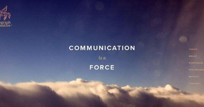
As someone studying web design, you’re probably curious what the future has in store for web designers. Well, it’s going to be bigger, bolder, and brighter than you may have imagined. Last year, trends included things like background videos, flat designs, and grid layouts, but while there will be more going on in 2015.
Looking Ahead In 2015
Here are five key themes emerging:
1. Branding
Importance of Color in Brand Identity
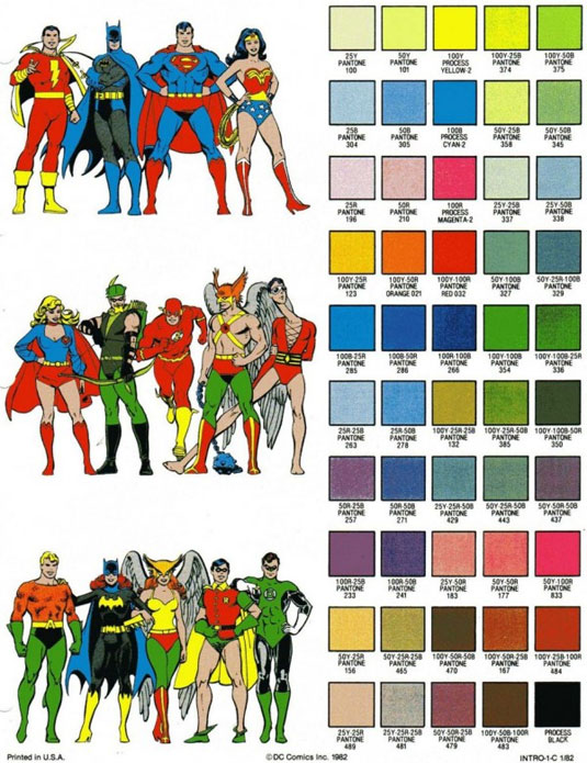
Currently, companies rely on offline strategies to brand their products, ranging from spokespeople and events to logos and color schemes. However, there is a tremendous amount that can be done with graphics and video technology to create branding elements. It’s possible that instead of a brand replicating branding symbols online, it will work the other way: Branding ideas will be conceived online and then show up in offline marketing.
2. Background Images
HOW TO USE LARGE IMAGES LIKE A PRO
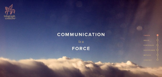
Background images are going to be big — not just larger, but as big as possible; in fact, big enough to fill the whole screen. This trend was kicked off by Apple as it showed off its new iPhone. There will be two versions of this theme: static or dynamic imaging. The static version will be a huge still shot—like, a woman in her PJs lounging on a couch peering into her laptop. The sophisticated version will be a short video clip—perhaps a panoramic view of a mountain top with a mountaineer as a focal point.
3. Cards

UX FLOWS: HOW TO CHAMPION YOUR CONTENT WITH CARDS
Since content has to suit different screens, one way that Google has found to make this engaging is to use card designs. Cards will have to be stylistically presented, perhaps displayed at an angle or with interesting borders to keep the presentation interesting. The use of cards makes it easy to create a website that looks good across a variety of computer and mobile platforms.
4. Vibrant Colors & Textures
UI Inspiration: Material Design
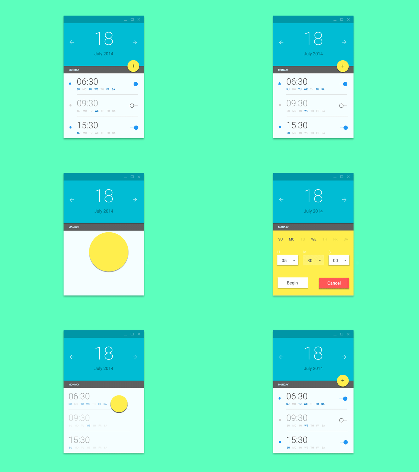
Once again, Google is leading the charge on this one. There will be more of a feel to design, similar to the tactile impression on a viewer of paper and ink artwork. Bright colors, contrasts, subdued backgrounds, muted sounds, and the use of soft lighting and shadows will be used to create an impression of fluidity and transition from one page to another.
5. Improvements
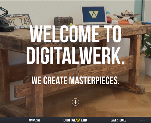
The Hottest Web Design Trends of 2014: Updated
There are many things that worked very well in 2014, and we should see many of these trends continuing. We can also expect refinements on what has worked well. Responsive web design will get more interactive, good typography will get better, and layouts will get more sophisticated.
Catching the Trend
With web design getting better, how do you ride the trend, giving customers what they want based on what they’ve seen their competitors doing online?
Here are 6 suggestions:
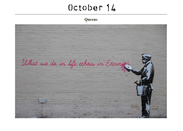
5 brilliant artist websites to inspire you
1. Study art. Spend more time studying art. Ultimately, web design is an art form. This means that the keener your aesthetic sense, the more you will be able to appreciate symmetry, color, and form. You’ll then intuitively figure out how to transform your vision into a visual experience using your digital palette. One good way of studying art is by visiting art museums, taking art classes, and joining art communities.

40 Web Design Blogs To Follow In 2015
2. Be curious. Visit cutting edge websites periodically. Google Nexus, for instance, have made their website look more like an art exhibit. So, make a list of the top ten websites and keep an eye on what they are doing and how they are evolving. You can learn a great deal simply from example.
10 awesome places for designers to hang out
3. Start networking. Share and learn from other designers. Rather than compete, collaborate. Find groups online or offline where other web designers hang out.
LEARN WEB DESIGN: 50+ OF THE BEST ONLINE EDUCATIONAL RESOURCES TO LEARN TO BUILD WEB SITES
4. Go back to school. If you’re self-taught or have developed web design skills to fill a need in your workplace, then you may be missing some essential skills that you never got around to learning—rather like a painter who skipped drawing classes. While you may be doing formidable work, imagine if you could get a formal education? Students who go through a graphic design degree from Platt College or a similar institution learn all the key elements that go into creating a responsive web design. Students also learn foundations for graphic design. They learn photo manipulation, prepress production, typography, digital illustration, layout, and composition.
5 Tips for Creating the Perfect Web Design Portfolio
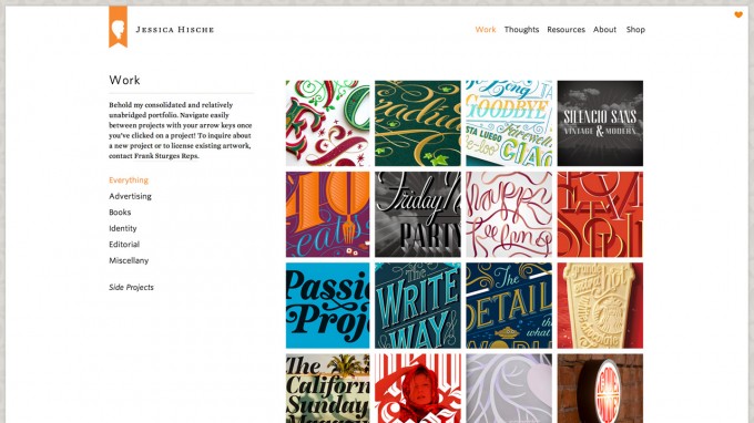
5. Build a new portfolio. Your current portfolio reflects how far you’ve come, but by making a new portfolio, where you now begin to incorporate some of the leading edge techniques you’re exploring, you’ll be able to track progress. A new portfolio will give you a framework to keep track of how you’re getting increasingly better. Eventually, when your 2015 portfolio is remarkable, you can phase out your old portfolio.

Essential Visual Feedback Tools For Web Designers
6. Get professional feedback. One of the fastest ways to improve is to get feedback. Here’s a story from a different industry that illustrates the value of feedback. Before WalMart became a billion dollar company, Sam Walton had studied his competition more intensely than anybody in the retail business. After he had exhausted his ideas on how to make WalMart better, he hit upon the idea of hiring the top retail consultants to walk through one of his stores. After their tour, they ripped apart almost everything he had done. Swallowing his pride, he implemented their ideas—and WalMart became a 160 billion dollar company.
In any profession, it’s the top ten percent who make the most money. If you want to be highly successful as a web-designer keep an eye on emerging trends, then figure a way to ride these trends to give clients much more than anyone else.


Great insight about the trends and thanks for the tips, too!