A company’s website is frequently the customer’s first interaction with the brand. In modern times, half of all internet users have been online since they were toddlers. They never lived in a world without the internet and know what they want.
What they don’t want is to browse a poorly designed site. Let alone join that site’s mailing list, make a purchase, or do any of the other things people do online.
A site’s web design can make or break the success of a company. Many companies opt to enlist a website design agency to assist them in creating the perfect design.
Difference Between Web Design & Web Development

People outside the tech world may think of web design and web development as the same thing. However, though a web designer may also be trained in web development, the two are very different.
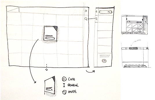
Web site designers create the visual appearance of the site, as well as its functionality. The designer takes the client’s ideas and makes a mockup of what the site will look like.
During web development, experienced coders use computer programming skills to turn that visual mockup into the actual working website.
Common Web Design Errors

Studies show that the majority of internet users prefer well-designed sites over basic ones. Beauty may be in the eye of the beholder, but unattractive websites aren’t as subjective.
Defunct websites Geocities and MySpace gave an entire generation the impression that they knew how to design websites without any professional training. Flashing images, colorful text, and blaring music may have set your personal page apart but have no place on a professional website.
What are some of the common web design errors that drive traffic away from a site?
- Distracting backgrounds. The site’s background should be simple and inviting. Loud colors or tiled backgrounds are generally unappealing to the eye.
- Hidden links and buttons. Internet users value their time and won’t spend it hunting down links or site navigation buttons.
- Irrelevant content. Visuals are good, but only if they are relevant to the site’s overall content. Blocks of text should also be avoided, even if they are relevant to the company. Blocks of texts shouldn’t exceed five sentences.
- Using the wrong font. In general, using the same font throughout the site is aesthetically, but some font changes for emphasis are okay.
- Not being mobile-friendly. More than half a website’s traffic likely comes from mobile devices. Therefore, a company’s website needs to be accessible on multiple platforms.
How to Get It Right

Now you know what not to do when brainstorming website design ideas. What does a good website entail?
- User-friendly navigation. This includes easy-to-find links and navigation buttons.
- Clear calls to action.
- Relevant images. There are several free image sites to acquire high-quality photos that are relevant to the site. Additionally, there should be a balance between text and photo usage.
- Pleasing color scheme. Pleasing to the eye but also not boring.
A website is often a potential consumer’s first impression of a company. Don’t let it be the last impression with a poorly designed website.


