The number of users accessing the web on mobile devices has grown by a whopping 222% in the last 7 years. Today, there are more mobile device users on the web than desktop users.
Thankfully, mobile learning solutions have emerged in numbers and grown in terms of technology to address this growing audience.
While there are plenty of mobile learning solutions to choose from, there are still many organisations that have not been able to experience the many promised benefits of providing training on a mobile device.
If you are also struggling with driving results through mobile learning, make sure you are not making any of the following mistakes:
Not Designing For The Smallest Possible Screen

One of the most common mistakes made by organizations switching to or incorporating mobile mashed learning is “copy pasting” their desktop training content.
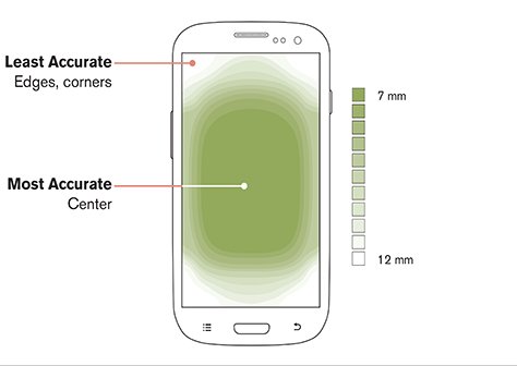
It is important to understand that the screen sizes in both training delivery devices (desktops and mobile devices) vary dramatically.
A mobile device cannot physically display the training material like a desktop screen without compromising on the quality of the experience of the user. Training delivered on mobile devices should be streamlined and focussed.
When you start developing a training experience for mobile devices, start by designing for the smallest possible screen. This way, it will be easier to understand the limitations of the mobile device display and you will be able to create a pleasing learning experience for your learners.
Adding Too Many Elements

Another common mistake is adding too many elements. While it is recommended in eLearning circles to use videos and images (visual content) to improve the effectiveness of your training efforts, too many visual elements can actually make your training experience more frustrating for the learners.
For starters, accessing several visual elements on a small screen can easily get distracting. At the same time, having huge blocks of text can be equally potent in turning your users away. It is important to have the right balance of text and visual content to keep the users interested and engaged.
Similarly, too many visual elements can also increase the load times on mobile devices with small processors.
Even when you choose only a select number of visuals for your mobile learning experience, it is important to ensure the visual elements are suited for mobile device use. For instance, if you are using a video, it is important to make sure that the pause button (along with other functional buttons) and large enough to be accessed easily yet small enough so that they don’t get in the way of the video’s visuals.

Besides thinking about the mobile screen experience and the processing capabilities of mobile devices, it is also important to think about the way users consume content on mobile devices.
Most of us are used to watching short videos on Instagram and Tiktok. This knowledge can be applied to designing training experiences for mobile users. Long form content, be it in the form of text or in the form of a video, may not work well in the case of mobile training.
Not Consulting The IT/LMS Team

Finally, it is important for learning administrators to loop in the LMS management team while designing the mobile learning experience.
Since a lot of the content will be delivered through a platform that they manage, you can expect to get some truly important insights on how the mobile learning experience can be made immersive and engaging.
Not to forget, the IT team will also help you with concerns like data integrity and user privacy.
Conclusion
The future of training will depend significantly on mobile devices and early adopters can definitely expect to experience some truly advantageous benefits. However, this is only true when the development and implementation of mobile training experience is perfected.


