Designing engaging, thought-provoking emails can seem scary when you’ve not got much experience – especially as business owners have so much else to do! Platforms like Klaviyo are great, but most often, it’s still you having to use those features – so you’re likely to be in need of a few Klaviyo tips!
That’s what we offer here, but don’t worry, they’re going to be understandable and actionable – meaning anyone can use them. So, without further ado, let’s see what’s what.
Eliminate Your Email Preheader Text

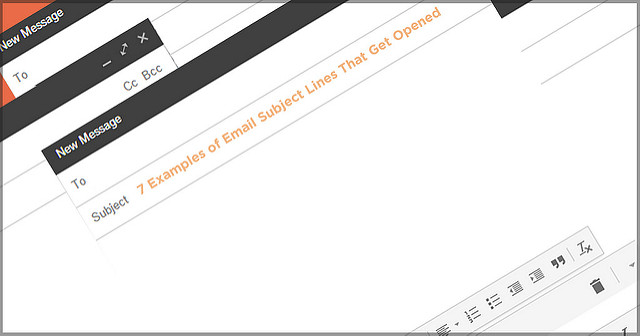
When an email is received, the preheaders offer a preview of the first few lines of the email. They can be great for ensuring your emails get opened, although once they have been, they sit there making everything else looking untidy.
So, the first of our Klaviyo tips is to do everything you can to stop your preheader text from destroying the great visual effects you’ve taken so long to produce. One way to do this is to reduce the size of the text and change the color to the same one your background features. This won’t stop it showing up before the email is opened, but it will hide it once it has.
Don’t Be Monotone With Your Fonts

Our next piece of advice is to ensure that you’re not monotone with your fonts, having the same one right the way across everything in your email. Klaviyo provides up to 19 different fonts to choose from, so make sure you mix things up, use italics, use bold, so that your readers aren’t falling asleep halfway through your email!
Having a variety of fonts adds nuance and depth to your emails, but don’t go overboard. 2-3 fonts is usually enough to achieve the intended result. Plus, make sure you use readable fonts – for obvious reasons!
Minimise the Viewable Whitespace


The next of our handy Klaviyo tips relates to the need to minimise white areas around your content, as it can make things look really B A R E! It is possible for your emails to be dominated by things that aren’t there, so make sure you’re using margins, graphics, images and other elements to pad things out.
It really is a question of moderation, so don’t pad things out too much so it all looks a bit busy and don’t do too little or you’ll achieve a barren-looking, largely unreadable email. Also, once you’ve determined your margins and spacing, make sure they’re consistent in every area.
Sometimes Small Differences Have BIG Effects!


Ok, so these Klaviyo tips might not seem like large measures to take, but by implementing just these few, you’ll get a lot of the basics right. When tackling yours, try and think of what you’d like to see when opening emails and what you wouldn’t – it’s what you’re asking of your potential customers.
The fundamentals are the fundamentals and we’ve covered just four here. There are many more you can find out about online or indeed, get a professional Klaviyo expert to assist. Many people choose to as there’s no avoiding the fact that marketing takes lots of time, effort and skill.


All that remains to be said is that we thank you for reading, we truly hope you find these tips useful and that your email marketing results soar as a result!